FinTech App Design
THE JOB
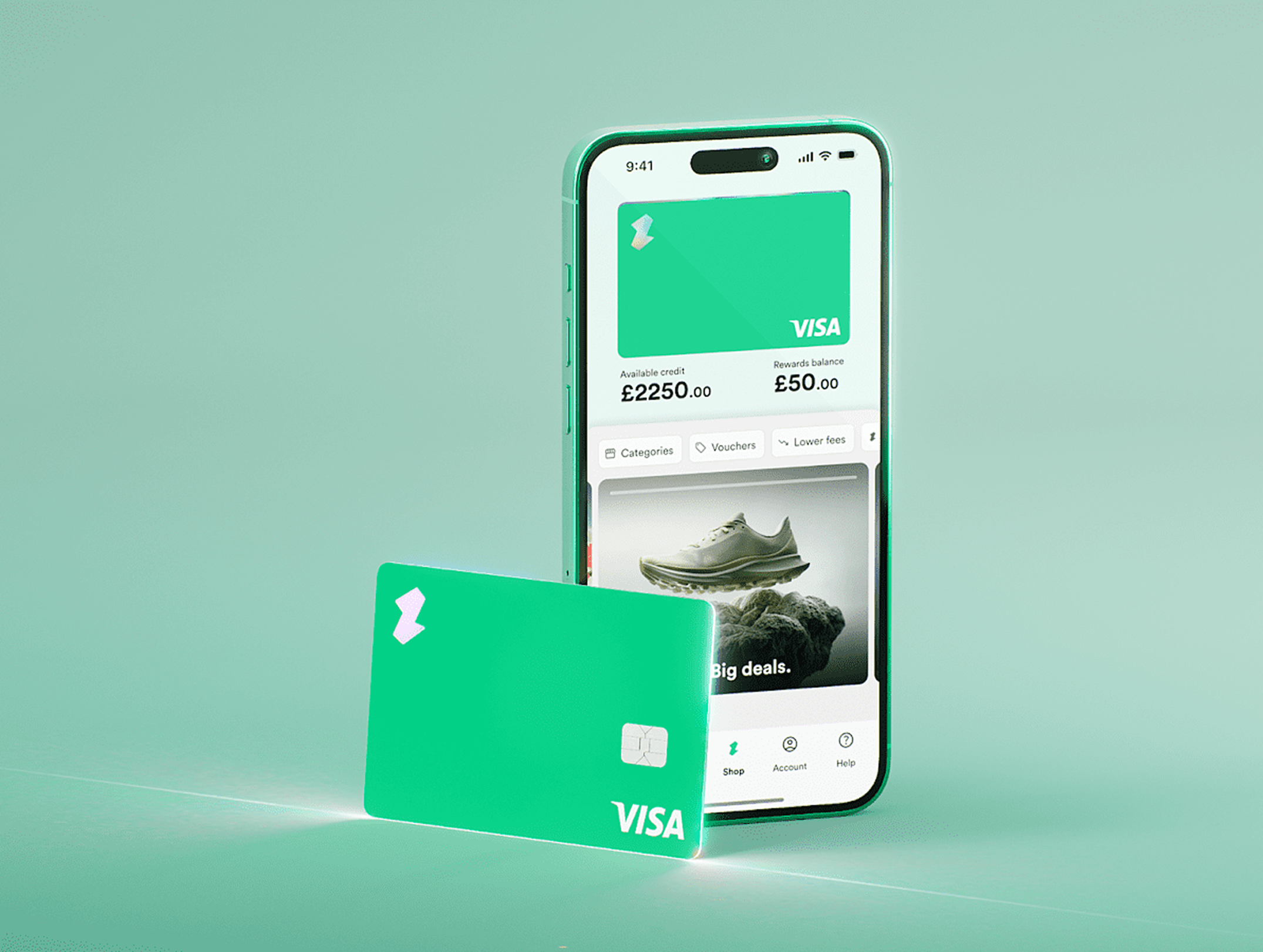
As part of the design team at this FinTech scale-up, I am responsible for everything the ‘Purchase’ section. This involves adding your card to a native wallet, activating your card for a desired retailer and setting your payment options, as well as many of the account level settings.
Video credit: Nicky Mawdesley
My areas of focus…
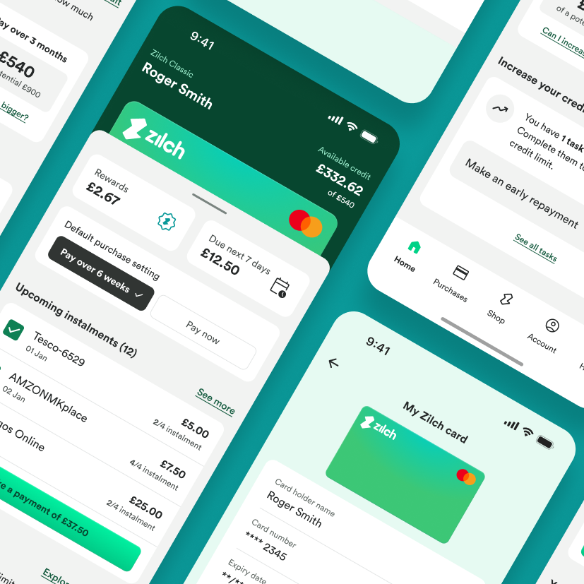
New Homepage dashboard
My first major project was to design a brand new app section, serving as a “financial dashboard” and place to house useful settings. Some of the work had already begun, but I had plenty of space to put my stamp on things.
Activating your card
With several product lines, our customers have an array of options when it comes to paying via credit or debit. If they come into the app to “enable” their card, the merchants usually pick up the fees making the service completely free to use.
Reskin the app
The design team were all brand new at the start of 2024, and so began the inevitable task of upgrading and reskinning the entire app. We brought our collective experience to the table, and all up-skilled on the latest Figma features, such as tokens.
Homepage MVP
Goals
User Adoption Rate: Reach a minimum of the 3rd most visited page on the app within a three-month of launch. The 'Shop' and 'Purchases' sections are expected to remain the most visited.
Increased credit limits: Enhanced exposure to outstanding credit building tasks should encourage user action.
User Engagement: Set a baseline for average session time on the dashboard to which we can grow as the page develops.
Outcomes
Improved Financial Clarity: Users can see their financial status clearly through real-time data displays, helping them make better decisions.
Streamlined Budget Management: The dashboard allows easy budget tracking and repayments, all in one place.
More sizable purchases: Data suggests users who change their default payment setting often make larger purchases. Greater exposure to this toggle should increase encourage this behavior.
Design Concepts
With a whole wealth of credit apps out there, I had a lot of inspiration to choose from. The header of the screen (with the card peak) was already in production, so as you can see, it’s present on each design. Whilst FROSTED was a happy accident I had come to enjoy as the most original concept, the masses favored a mix of the PLAYFUL and FINTECH designs.
Take a look at them apples…
Following the launch, the homepage quickly ascended to become the second most visited screen within the navigation, a status it has consistently maintained. Our users do continue to access the application primarily through the 'Shop' screen, meaning this channel remains the most frequented.
Since the summer, both Gross GMV and AOV have shown a steady upward trajectory. While it is challenging to directly attribute these improvements to the homepage, we can confidently assert that there has been no detrimental impact resulting from its introduction.
What’s next?
This is just the beginning for our little financial hub. We want to make it even more useful and engaging: Telling users how efficiently they’ve used their card; Highlighting offers; Fast access to card freezing; Expanding on our Rewards offering; Creating a notification centre; Even allowing users to customise the dashboard to suit their needs.