Website & App Redesign
THE BRIEF
Create a simple and intuitive journey for new and repeat customers, across both web and mobile apps.
Please note as of Jan ‘23 only some of this work is live. Some is concept only and some is under NDA until release.
Video credit: @LycheeTV
My areas of focus…
Going dark.
Once the latest rebrand had been finalised, we set about working on light and dark mode for the apps - taking into account native fonts, colour handling and accessibility.
The boring bits.
Generating a template for generic content and ‘utility’ pages is a task that is often forgotten. For GC I created a comprehensive template, to cover as many eventualities as I could perceive.
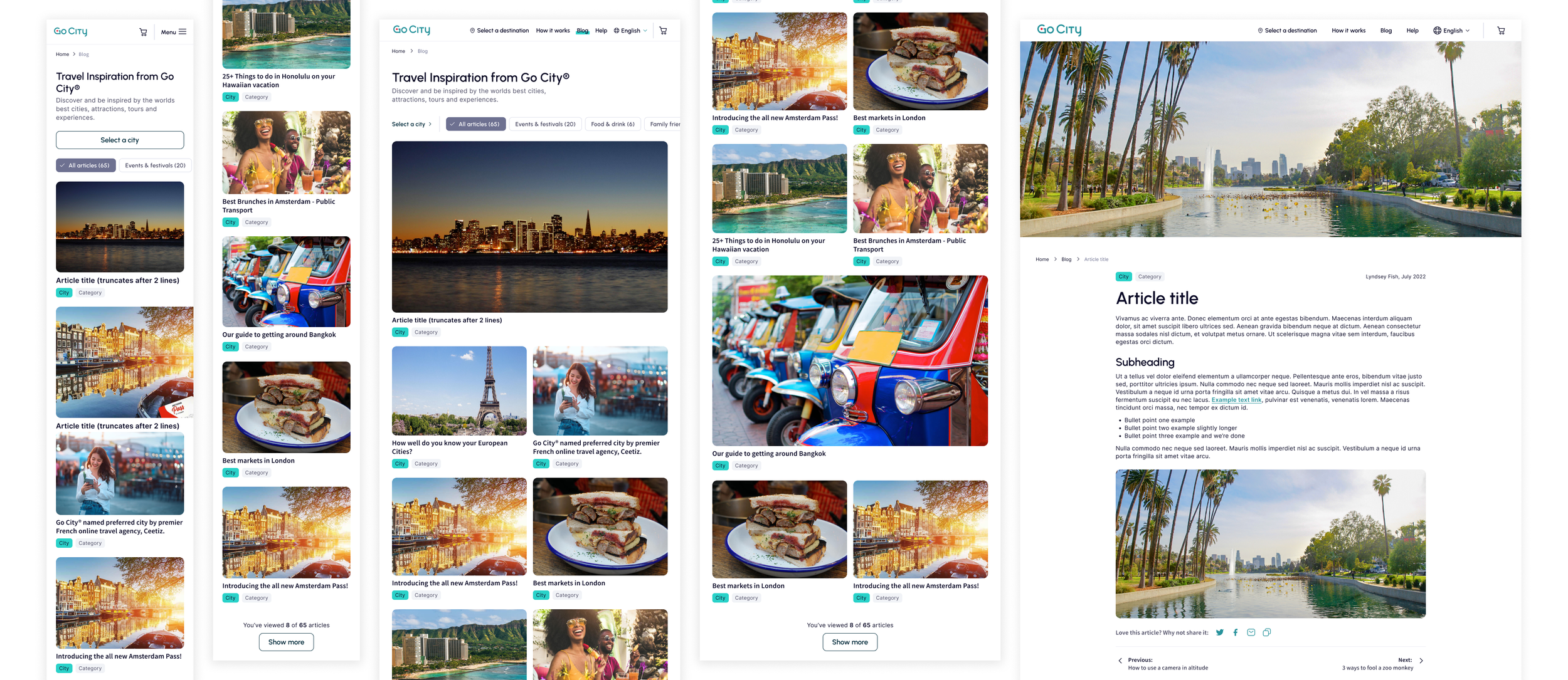
Blog migration.
The original blog content was to be migrated to the new Magnolia platform, with a fresh new look and feel. My designs allowed for a first stage ‘basic’ layout, with consideration for more rich content after launch.
Checking out.
One of my initial tasks was to review and upgrade the checkout experience. I worked closely with the devs to create a one-page checkout, with best-practice functions such as predictive address search and native payment options.
Cool concepts.
Adding stronger social elements to the app experience would increase brand trust and awareness. I concepted an idea for users to collect ‘stamps’ upon each city visit, and how these might sit within the app, as a little bonus feature.
Advertising.
I generated artwork for the App and Play stores - using the latest formatting to allow for a more playful collage.

I ran a workshop to deep dive into the needs and requirements for the Global homepage.
Goals
Alignment on the purpose of the homepage
Agree users needs & requirements
Discuss & agree on current challenges
Clarity on current key HP statistics
Outcomes
Clear understanding of potential solutions
Clarity on prioritisation of feature ideas
A plan and agreement on next steps in creating the new homepage
Below are the concept designs.
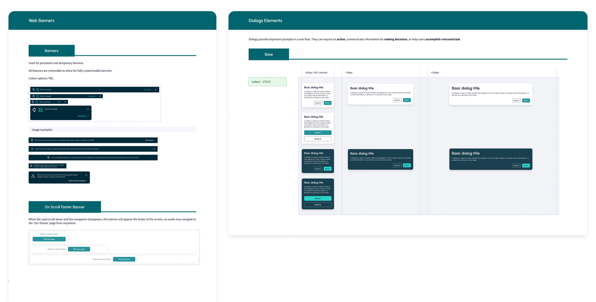
Design system.
A new brand team came onboard a year into this project, and GC got a complete facelift. This meant the entire design system had to be updated and re-evaluated; new fonts, new colours, new logos, new components. Everything. I was solely responsible for this update and in the geeky way that designers do, I took great pleasure in meticulously updating and reformatting every component.
It was the biggest design system I have every worked on, with all the base elements in place, as well as a vast library of bespoke features and variants. As always, I worked closely with the dev teams when it came to accessibility, as well as the fonts and colours to be used in the native environments.


